
This article is a short demo how to create gauge charts utilizing the Googleviz package.
First lets load our libaries we will need for this tutorial
library(googleVis)
library(reshape2)
Note the capitalization of the GoogleVis package.
Now we need some data to visualize. Let’s pretend we are a manager for a small team, and get weekly reports. This gauge chart will tell us our employee attendance every day for the previous week.
We created a small set of data with Day of the week and attendance count. We had to do a little bit of data manipulation to get the data in the right format for visualizing. The documentation for the package can be found here. These charts are best viewed in a web browser, and sometimes I have had issues when trying to generate these charts without internet connection, so keep that in mind. Each gauge displays its respective value in the bottom of the gauge. I think gauge charts are great KPI(Key performance indicators) visualize tools.
library(googleVis)
library(reshape2)

#creating data
staff_count <- c(12, 13, 15, 16, 14)
the_day <- c("Monday", "Tuesday", "Wednesday", "Thursday", "Friday")

#manipulating data
the_day <- as.factor(the_day)
staff <- melt(data.frame(the_day,staff_count))
staff <- as.data.frame(staff)
staff <- staff[,c(1,3)]

#creating visualization
Gauge <-  gvisGauge(staff,chartid='September_23_to_27_2019',
                    options=list(min=0, max=16, greenFrom=13,
                                 greenTo=16, yellowFrom=7, yellowTo=13,
                                 redFrom=0, redTo=7, width=750, height=200))
#plotting visualization
plot(Gauge)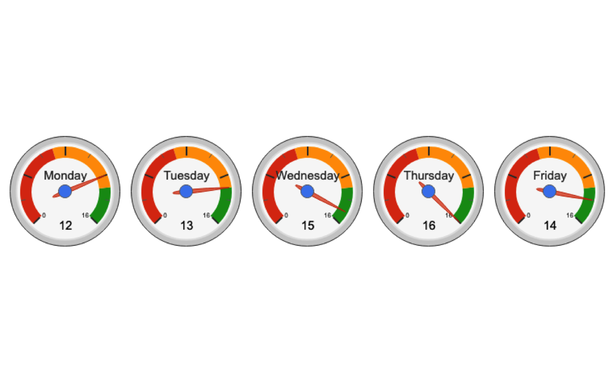
And that’s it! Only about 15 lines of code to create awesome Google gauge charts in R!